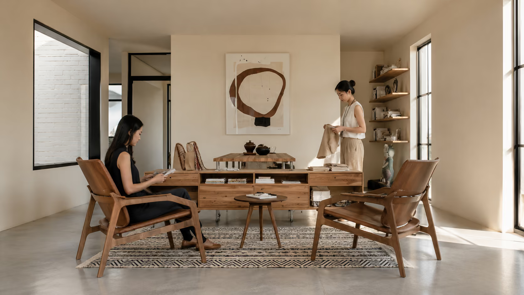
At Too.architects, architecture and interiors are read as one spatial experience.
2
1
2
3
4
5
6
7
8
0
0
1
2
3
4
5
6
7
8
0
+
6
1
2
3
4
5
6
7
8
0
0
1
2
3
4
5
6
7
8
0
+
7
1
2
3
4
5
6
7
8
0
+
1
1
2
3
4
5
6
7
8
1
2
1
2
3
4
5
6
7
8
0
+
Every scale of space affects the next.
The building context, interior plan, material, and way people use the space are never separate. Reading every scale together makes the project clearer and helps the space hold together with reason.
The early studio grew through real briefs: homes, workplaces, and small commercial spaces that had to be read carefully. Those projects shaped a simple way of working: begin not with style, but with what the space needs.
As the team worked across more project types, the brief was no longer only about plan or atmosphere. It included real use, movement, light, material, and the details people touch.
Past projects gradually made the studio's direction clearer. It does not place a fixed style onto every space. It begins with what is already there, then develops design that fits that context.
The studio's current direction is to make building, interior, and detail read in the same direction, from the first light entering the space to the material, edges, corners, and points people touch.
How we bring your vision to life seamlessly
The work begins by reading the brief, existing space, light, orientation, and the way people will arrive.
Once the conditions are clear, the studio sets the order of spaces, movement, and the weight of each part.
Plans, materials, proportion, and details are tested together because each decision affects the next.
The design must still read clearly when people use the space, not only when it is seen on paper.
Our commitment to excellence and innovation
The existing building, light, orientation, and way people arrive often reveal something from the beginning. The studio reads these conditions before shaping the form or atmosphere of the project.
A space has its own sequence, from arrival and movement to the moments where people pause. Thinking through that order helps each part connect without needing to explain itself too much.
Every choice should be able to explain how it helps the project, not only how it improves the image. The studio tests whether that choice serves the place, the users, and the real experience.
We measure design by what people meet inside the space, not only by what appears in images. When the space is actually used, the work should still read clearly and feel continuous.
SELECTED PRESS
Our architects and designers.















Who we design for


Discuss your project with our design team